
Introduction to Data Visualization in Education
Data visualization is an essential aspect of transforming raw data into a format that is more accessible and comprehensible for both educators and students. In the educational sector, the significance of visual representation of data cannot be overstated, as it plays a critical role in enhancing learning experiences and outcomes. By transforming complex data sets into intuitive visuals, data visualization fosters a deeper understanding of concepts and trends, which can ultimately lead to improved academic performance.
One of the primary benefits of utilizing the best tools for data visualization in education is the capability to engage learners more effectively. Traditional methods of presenting information, such as text-heavy reports, can often lead to disengagement among students. However, visual tools provide dynamic ways to present information, allowing students to absorb content through charts, graphs, and interactive dashboards. This method not only stimulates interest but also aids retention of information by aligning with various learning styles.
Additionally, data visualization is instrumental in facilitating informed decision-making for educators. By leveraging visual tools to analyze student performance data, teachers and administrators can identify trends and make data-driven decisions that improve teaching strategies and learning outcomes. The utilization of these tools allows educators to monitor academic progress effectively and tailor interventions to meet the individual needs of students. Furthermore, data visualization can be employed to highlight key performance indicators and illuminate areas requiring attention, thus promoting a proactive educational environment.
In today’s data-driven landscape, it is imperative for educational institutions to adopt effective visualization tools that cater to their specific needs. The selection of appropriate technologies not only enhances understanding but also fortifies the educational framework, ultimately leading to a more enriching learning journey for all stakeholders involved.
Criteria for Selecting Data Visualization Tools
When educators and institutions consider implementing data visualization tools, it is crucial to evaluate several key criteria to ensure the chosen solutions effectively support educational objectives. These criteria not only contribute to the functionality of the tools but also impact user engagement and overall learning outcomes.
Firstly, user-friendliness stands as a fundamental factor. The best tools for data visualization in education should offer intuitive interfaces that allow educators and students to easily navigate through the platform. A steep learning curve can lead to frustration and hinder the intended learning experience. Thus, selecting tools that provide comprehensive tutorials and support can facilitate smoother adoption.
Another important criterion is compatibility with existing systems. Educational institutions often utilize various platforms for learning management, assessment, and more. Therefore, it is essential that any selected data visualization tool seamlessly integrates with these systems to ensure a cohesive flow of data and minimize disruptions in current workflows.
The variety of visualizations available also plays a significant role in the decision-making process. Different pedagogical needs may require distinct types of charts, graphs, and maps. Tools that offer a wide range of visualization options enable educators to present data in multiple formats, catering to diverse learning styles and preferences.
Cost is an additional consideration that cannot be overlooked. Some of the best tools for data visualization in education may require subscription fees or licensing costs. Educators must assess their budgets and identify tools that provide the best value for the resources available. Open-source platforms can be a cost-effective alternative, though they may lack some advanced features.
Lastly, flexibility in data handling is essential. Effective data visualization tools should allow users to easily manipulate, analyze, and update data as needed. This flexibility ensures that educators can keep their visualizations current and relevant, enhancing the learning experience with timely information.
Popular Data Visualization Tools for Educators
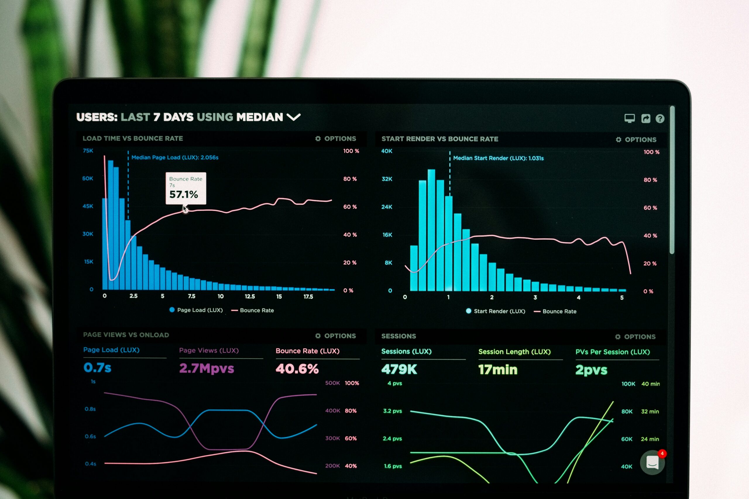
In the realm of education, data visualization tools have become indispensable for educators seeking to enhance learning through insightful data representation. Among the best tools for data visualization in education, a few standout options have gained recognition due to their robust features and user-friendly interfaces. One of the most notable tools is Tableau, known for its powerful analytics capabilities. Educators can use Tableau to create interactive dashboards that allow students to explore data dynamically, fostering critical thinking and analytical skills.
Google Data Studio is another highly regarded tool that provides a seamless way for educators to transform raw data into visually appealing reports. Its integration with other Google services allows users to pull in data from various sources effortlessly. This tool is particularly useful for instructors who wish to present assessment results or survey data, helping students to understand performance trends and areas for improvement.
Microsoft Power BI also merits attention, as it empowers educators to visualize complex datasets. With its intuitive interface, users can create compelling visual aids that simplify the interpretation of academic trends and student performance metrics. Power BI’s collaboration features make it a favored choice for teams working on curriculum development or school improvement initiatives.
Lastly, Canva has emerged as a popular choice among educators who prioritize design along with data visualization. This user-friendly graphic design tool offers a variety of templates that can be customized to create engaging infographics and visual presentations. Educators often leverage Canva to make learning materials more visually appealing, thus enhancing student engagement while conveying critical information effectively.
These tools collectively represent some of the best options available for educators aiming to leverage data visualization in their teaching. Each tool has unique strengths that can be utilized to enrich the educational experience, ultimately leading to improved outcomes for students.
Integrating Data Visualization into Curriculum
In contemporary education, the importance of data literacy cannot be overstated. Integrating data visualization into the curriculum is an effective strategy to foster this skill among students. Data visualization tools create dynamic learning experiences that enhance understanding and retention of complex information across various subjects. Educators can utilize these tools to transform raw data into visual insights, allowing students to engage more deeply with content.
To seamlessly incorporate the best tools for data visualization in education into lessons, teachers must first identify the specific learning objectives. For instance, in a mathematics class, educators might use visualization tools to illustrate statistical concepts, such as mean, median, and mode, by presenting data sets visually through graphs and charts. This method not only aids comprehension but also clarifies abstract concepts, helping students grasp the implications of data analysis.
Science educators can employ data visualization tools to present real-time data collected from experiments or simulations. For example, visualizing climate change data on temperature variations over decades can evoke critical thinking skills and discussions among students, prompting them to infer trends and patterns. These engaging methods illustrate the collaborative nature of data interpretation, making learning more interactive.
Furthermore, case studies from schools that have implemented data visualization tools reveal their positive impact on student engagement and achievement. Institutions that incorporate visualization in subjects such as history, social studies, or health have noted significant improvements in students’ abilities to analyze and interpret data. This enhanced grasp of information extends beyond academic competencies; it prepares students for real-world challenges that require robust data literacy.
In conclusion, leveraging the best tools for data visualization in education cultivates essential skills in students while enriching the learning experience across disciplines. As educational landscapes evolve, adopting visualization practices will be paramount in preparing students for a data-driven future.
Case Studies: Success Stories in Data Visualization Usage
In recent years, various educational institutions have successfully harnessed the power of data visualization tools to enhance teaching and learning outcomes. These case studies exemplify the transformative potential of these tools and can serve as inspiration for others in the field of education.
One notable example is the University of Pennsylvania, which implemented a comprehensive data visualization platform to analyze student engagement and success rates. By utilizing various data visualization techniques, the institution was able to identify trends in student performance and participation in different programs. This led to the development of targeted interventions aimed at improving student retention rates, ultimately increasing overall academic performance.
Another compelling case is from the Atlanta Public Schools, which adopted data visualization tools to tackle disparities in student achievement. By employing heat maps and dashboards, educators could visualize data at the classroom level, allowing for quicker identification of areas needing support. The insights gained from this approach enabled teachers to adapt their instructional strategies to better meet the needs of diverse learners, contributing to improved academic outcomes across the district.
In Canada, the University of Alberta explored the use of interactive data visualization tools in their graduate programs. The institution created visual narratives that allowed students to engage with complex datasets in an intuitive manner. This not only facilitated a deeper understanding of the subject matter but also enhanced the students’ ability to communicate their findings effectively. As a result, graduates reported feeling more prepared for the data-centric demands of the workforce.
These case studies illustrate that the best tools for data visualization in education can significantly impact teaching methodologies and student learning experiences. By navigating the challenges associated with implementing such tools, these institutions have reaped substantial benefits, paving the way for more data-driven education strategies.
Innovative Approaches to Student Engagement through Data Visualization
Data visualization in education serves as a powerful tool to enhance student engagement and facilitate deeper understanding of complex concepts. By integrating best tools for data visualization in education, educators can create an interactive and stimulating learning environment. One innovative approach is using graphical representations of data to foster collaborative projects. For instance, students can utilize tools like Tableau or Google Data Studio to present findings from research projects. This not only encourages teamwork but also allows students to negotiate meaning through visual storytelling.
Additionally, educators can incorporate real-time data analysis exercises into their curriculum. By utilizing live data feeds, such as local weather statistics, economic indicators, or academic performance metrics, students can analyze trends and patterns in real time. This hands-on experience not only makes the learning process more relatable but also piques students’ interest in data-driven decision-making. Such activities not only build analytical skills but also foster critical thinking as students discuss and reflect on the implications of their findings.
Furthermore, the incorporation of gamified elements into data visualization makes learning more engaging. For example, utilizing tools such as Infogram or Piktochart, educators can create interactive quizzes where students visualize their knowledge retention through graphs and charts. This can be implemented as a form of assessment that not only gauges understanding but also transforms the learning experience into an enjoyable activity. By blending creativity with analytics, the best tools for data visualization in education enable students to take ownership of their learning, making it an active rather than passive process.
Incorporating data visualization into lessons can also extend to subject-specific applications, such as in the sciences, where students can visualize experiments and data sets, or in social studies, where historical events can be presented through engaging infographics. Through these innovative methods, data visualization becomes a cornerstone of active learning in education.
Challenges in Data Visualization Adoption in Education
As educational institutions increasingly recognize the importance of data-driven decision-making, the adoption of data visualization tools is met with several challenges. One prominent issue is the technical barrier that many educators face. Not all teachers and administrators possess the level of technical expertise required to effectively use advanced data visualization software. This lack of proficiency can hinder the ability to generate meaningful insights from data, ultimately limiting the potential benefits of employing the best tools for data visualization in education.
Furthermore, the need for professional development cannot be overlooked. Educators often require training to fully harness these tools, which can be a substantial time and financial investment. Without continuous professional development, even the most sophisticated tools may go underutilized or misused, preventing schools from realizing the potential impact of data visualization on teaching and learning outcomes.
Data accessibility also poses a significant challenge. Many institutions struggle with disparate data systems that make consolidating information for visualization purposes difficult. If educators do not have easy access to the relevant data, they cannot leverage the best tools for data visualization to enhance their teaching strategies. This lack of accessibility can also lead to inconsistencies in data interpretation and reporting, further complicating the decision-making process.
Lastly, resistance to change is a pervasive barrier within educational environments. As schools transition to data-informed practices, some educators may be hesitant to adopt new methodologies that involve data visualization. This reluctance can stem from comfort with traditional teaching methods or skepticism regarding the efficacy of data analysis. Addressing this resistance requires a cultural shift within institutions, emphasizing the value that data visualization can bring to education.
Overall, while the challenges in adopting data visualization tools in education are significant, they can be navigated through targeted interventions, proper training, and a supportive institutional environment that encourages change.
Future Trends in Data Visualization for Education
The landscape of data visualization in education is rapidly evolving, influenced by technological advancements that enhance the way information is presented and interpreted. One of the most promising trends is the integration of artificial intelligence (AI) into data analytics. AI-powered analytics are capable of processing vast amounts of data at unprecedented speeds, generating insights that can inform teaching strategies and improve student outcomes. By identifying patterns and trends in real-time, educators can tailor their approaches to meet the diverse needs of learners, thereby fostering a more personalized learning environment.
In addition to AI capabilities, augmented reality (AR) is emerging as a transformative tool in educational data visualization. AR technology superimposes digital information onto the real world, allowing students to interact with data in a more immersive and engaging manner. For instance, instead of static graphs displayed on a screen, learners can visualize complex datasets through interactive AR applications that facilitate better comprehension. This dynamic representation of data alters traditional teaching methods, making the learning experience more captivating and effective.
Another notable trend is the rise of interactive dashboards that enable educators and students to explore data intuitively. These dashboards offer customizable views of information, allowing users to manipulate datasets and visualize outcomes in various formats. Such interactivity not only encourages deeper engagement with the material but also equips students with essential skills in data literacy that are increasingly valuable in the modern workforce. As education systems begin to incorporate these best tools for data visualization in education, the dynamic between teachers and students can shift towards a more collaborative model of learning.
As we observe these advancements, it becomes clear that the convergence of AI, AR, and interactive technologies will significantly shape the future of data visualization in education, enhancing the ways in which educators communicate information and students absorb knowledge.
Conclusion: The Role of Data Visualization in Educational Success
Data visualization has emerged as an essential component in the educational landscape, significantly impacting both teaching methodologies and learning outcomes. The best tools for data visualization in education enable educators to effectively present complex data in a way that is easily understandable, engaging, and actionable. By transforming raw data into visual formats, educators can uncover trends, patterns, and insights that might otherwise remain hidden in spreadsheets or databases.
As discussed, the integration of data visualization tools in the educational setting allows for enhanced engagement among students. These tools empower learners to interact with data, fostering a deeper understanding of the subjects at hand. Whether it is through graphs, charts, or infographics, the visual representation of information can stimulate discussions, enhance retention, and promote critical thinking skills among students. Consequently, students are better prepared to analyze information and draw conclusions, essential skills for their academic and professional futures.
Furthermore, the application of effective data visualization aids educators in making informed decisions. With robust data at their fingertips, teachers can identify learning gaps, track student progress, and adjust instructional strategies accordingly. By leveraging the best tools for data visualization in education, educational institutions not only improve teaching practices but also enhance overall student performance and satisfaction.
In light of these reflections, it is evident that data visualization stands as a powerful ally in the pursuit of educational success. We encourage educators, administrators, and stakeholders to explore and integrate these tools into their practices. By doing so, they can harness the full potential of data visualization to support and improve the learning experiences of students.
- Name: Sumit Singh
- Phone Number: +91-9835131568
- Email ID: teamemancipation@gmail.com
- Our Platforms:
- Digilearn Cloud
- EEPL Test
- Live Emancipation
- Follow Us on Social Media:
- Instagram – EEPL Classroom
- Facebook – EEPL Classroom